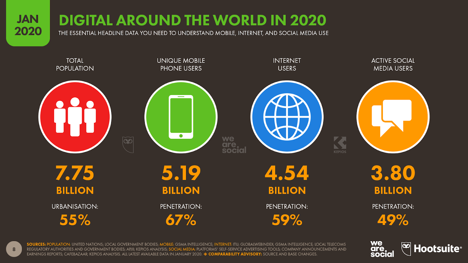
Did you know that over 3 billion people use social media?
That’s about half the world’s population, and you would be making a huge mistake not taking advantage of this to advertise your business. and consider advertising designs
Advertising through social media can be very competitive, though.
The social media advertising market is the second-largest market within digital advertising, raking in over 90 billion dollars in 2019 alone.
A great way to set your ad apart is through a well-thought-out design that effectively reflects your intended message and achieves its specific goal.
Whether that is attracting more customers, making more sales, or creating awareness for a cause.
In this article, we’ll unravel 9 hacks for creating Advertising designs that set your ads apart and increase your conversion rates.
But first, you don’t want to miss this critical stage:
The Pre-Design Stage
The pre-design stage is to an ad designer what the outline stage is to a writer.
It’s always best to start here so that you’re not just working in a vacuum. This stage will help you choose the most effective design for your ad.
Your pre-design stage should address the following points:
Define Your Goal
Ads are usually created to achieve one of three goals: to make more sales, for brand awareness, or to effectively gain exposure for a cause.
Determine your ad’s specific goal so you can tailor your design to effectively reflect it.
Identify Your Target Audience
Identify your target audience by looking at your current customers and then creating a buyer persona to get a clearer picture of who exactly you’re targeting.
This helps you determine the exact design that will resonate most with them.
Determine Your Social Media Channel(s)
Determining the best channels and your social media agency will be a lot easier once you’ve identified your target audience.
For instance, you’re more likely to convert better on LinkedIn if your target audience is B2B professionals.
But a lot less likely if your target is stay-at-home mums looking for the next big thing in cleaning supplies (Facebook may be your best bet for that).
Familiarise Yourself With the Rules
Every social media platform has rules governing the running of ads. To get your ads accepted in the first place, you need to make sure you follow these rules.
This cheat sheet by DigiBubble addresses some of these requirements:
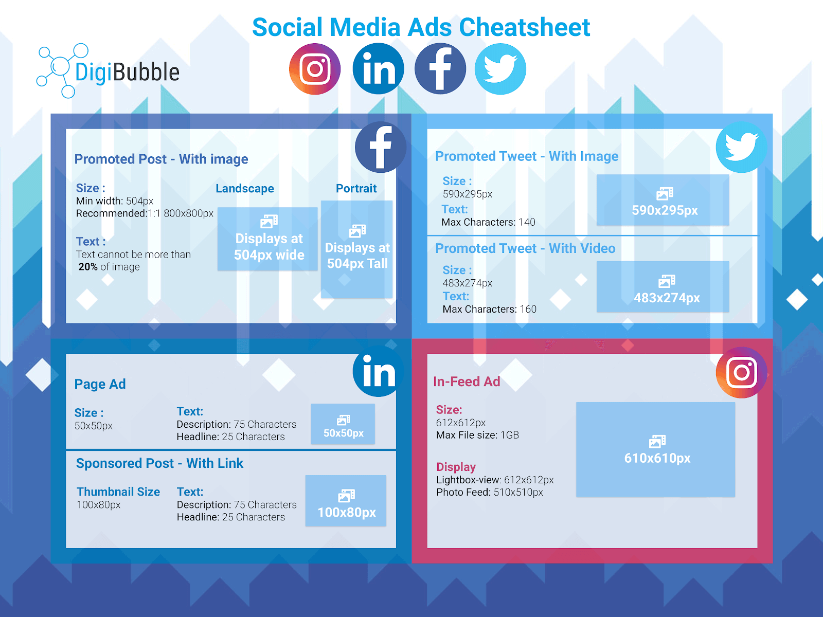 Image: DigiBubble
Read and understand Facebook’s, LinkedIn’s, and Twitter’s ad policies.
Now that we’ve gotten the pre-design stage out of the way, let’s get started with our hacks!
1. Go Minimal
The key trait of a minimal ad design is simplicity. It features a specific visual message, rather than cramming different images into one small space.
Which can be very confusing and counter-productive for your target audience.
The result of using a minimal design is a neat, organized, and easily understandable visual message that ultimately leads to a higher conversion rate.
Example: NikeID “Customize It Your Way”
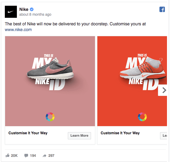
Nike’s simple and straightforward ad focuses all the attention on their customized sneakers.
Effectively sending a message that people can have their sneakers made with whichever Advertising designs they want.
2. Apply Visual Metaphor
Make a visual comparison between your message and a powerful situation that will elicit the right emotions.
It will most likely look slightly exaggerated, but that’s okay because your goal is to make sure your target audience takes your message seriously.
Example: Elter “An Unwashed Vegetable…”

Elter did a great job here by comparing an unwashed vegetable to a deadly weapon. The image accurately depicts a nuclear explosion, even though it’s just a mushroom.
On the surface, this message may seem exaggerated but the reality is that foodborne illnesses can be deadly and Elter wants consumers to wash their vegetables to stay safe.
3. Show More, Tell Less
The attention span of internet users continues to dwindle.
This may be because people are being constantly bombarded by multiple attractions all at once and, as a result, have learned to accept or reject a certain ad or post within a few seconds.
Consequently, your target audience may not have the patience to read through long ad copy.
When designing your ads, take advantage of image messaging. Make your image powerful enough that you don’t need a lot of words to explain it.
Make it something your audience can stumble upon on social media and immediately ‘get it’. It’s important that their connection to your message happens instantly.
Example: Coca-Cola’s Long Can
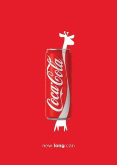
Coca-Cola did an incredible job here by comparing their can’s length to the neck of a giraffe. This gives people the impression that the can must be very long, therefore it must contain more drink.
The Advertising design effectively captures all this in the visuals alone.
4. Tell All With Few Words
You don’t have to use an image in your ad design if you can effectively deliver your message in a few words. However, you must make sure that you capture the goal of the ad.
Example: Seagram India Drink-Driving Awareness
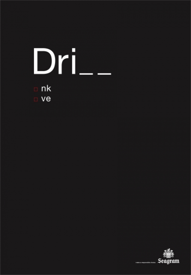
In just a few words, Ogilvy effectively captures the message behind the ad: you can either drink or drive.
This ad is a simple, blunt, and straightforward warning that will set people straight.
5. Drive Home Your Point With “Before and After” Ads
“Before and after” ads can be very effective at proving the quality of your brand. You show potential customers a clear picture of the benefit(s) they can expect from your product or service.
Example: ABC Dentistry’s Free Whitening
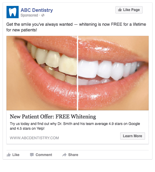
ABC Dentistry displayed an impressive “before and after” teeth whitening result. Using this image is more likely to convert than text describing how their service results in whiter teeth.
6. Share Impressive Statistics
Statistics are a great way to draw new customers to your business. They help your target market understand why they should choose you over numerous other businesses in your field.
Display statistics you’re proud of to gain more credibility in your target market.
Example: CooperHealth’s “Coronary Artery Bypass Surgery”
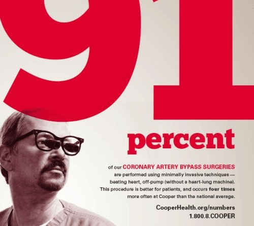
CooperHealth is sure to capture everyone’s attention with their bold display of “91 percent”.
Getting to the 91 percent mark in anything is impressive, and this will definitely lure people into reading their relatively long ad copy.
Consequently, their target market is sure to appreciate what they have to offer.
7. Use Visual Exaggeration
Although the use of visual exaggeration has come under fire due to its abuse, it’s still a commonly used and effective strategy in advertising.
We personally believe making use of visual exaggeration is a great asset, as long as you don’t go overboard.
Visual exaggeration hypes a product or service’s main benefit to a fantastic level and makes it much more appealing to the target market.
An appropriate use of this strategy should tell the audience that your product isn’t exactly what is depicted in the ad but can achieve a similar result.
Example: Nikon Camera
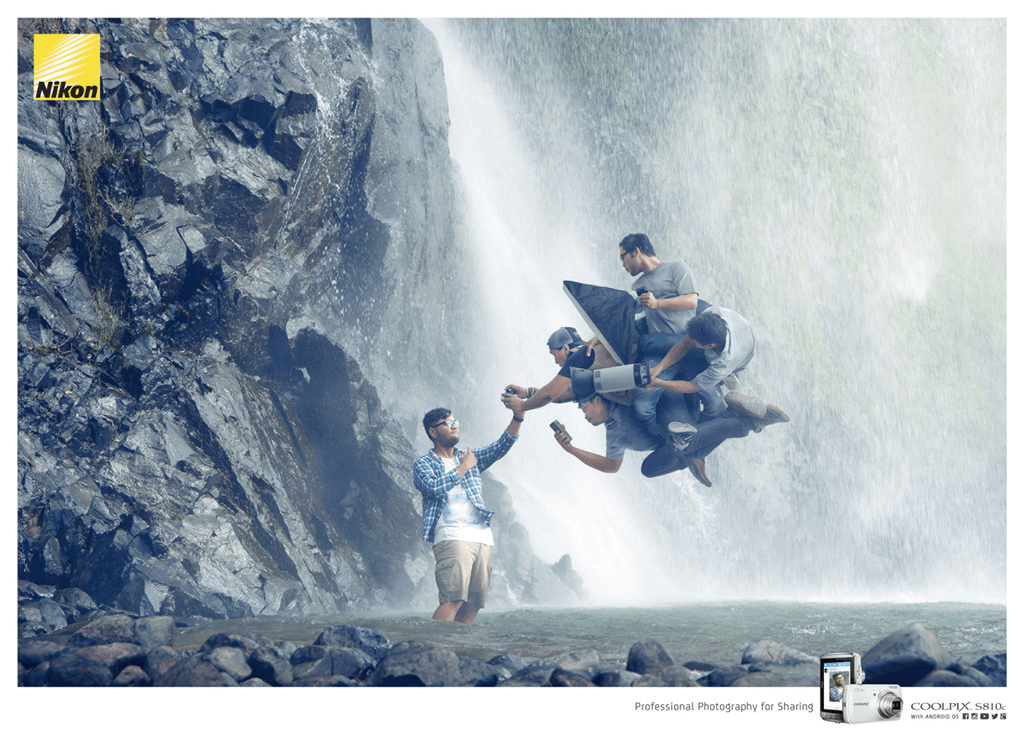 The Nikon Advertising design uses visual exaggeration to create the impression that taking a picture with their camera is similar to having your own professional photography crew.
This will ultimately attract their target audience to its quality and lead to more sales.
8. Focus Attention With Whitespace
That empty space in your Advertising design can make all the difference.
It prevents clutter and draws more attention to the visual/textual message. It also ensures that the message within your design is fully understood, thereby leading to more conversions.
Moreover, brands may use whitespace to convey simplicity and class. For instance, a key feature of minimalist designs is its abundant use of whitespace.
Example: Literacy India “Opportunity Begins with Education”
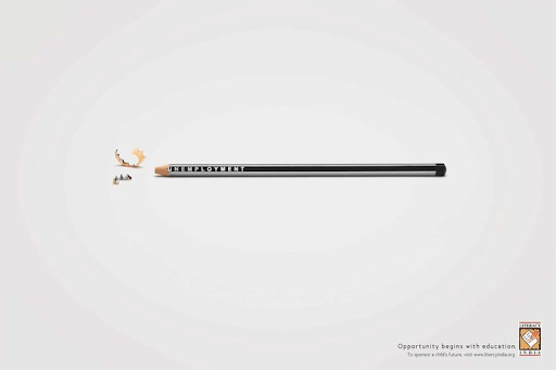
Literacy India’s design emphasizes its visual message by surrounding a specific visual image with empty space.
This focuses the viewer’s attention on the image, which carries the powerful message behind the ad: Education eradicates unemployment.
9. Don’t Forget These Four Key Features
A solid conversion strategy should provide all the information a potential customer needs to reach your business.
This will ensure that you’re not losing customers to close competitors because they’re unable to reach out to you.
Your Advertising design should include your business name, a short ad copy effectively explaining your product or service, a call to action, and a means of contact (website, email, or physical address).
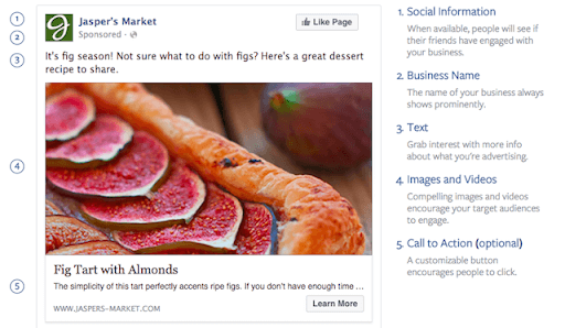
Let’s Do This!
Nailing the best Advertising design for your product, service, and target audience is essential to achieve high conversion rates and boost sales.
Here’s a quick recap of 9 hacks you should follow to create high-converting Advertising designs:
Choose a Minimal Design
Apply Visual Metaphor
Show More, Tell Less
Tell All With Few Words
Drive Home Your Point With “Before and After” Ads
Share Impressive Statistics
Use Visual Exaggeration
Focus Attention With Whitespace
Don’t Forget These Four Key Features
Is designing innovative ads too overwhelming to manage on your own?
We’re here for you!
Creative Blend has a team of professional ad designers that has positively transformed businesses through high-converting ad designs.
Reach out to us for Creative adverting Services today and become our next success story!
Also, You can find us at the top creative agencies on the Designrush list.

